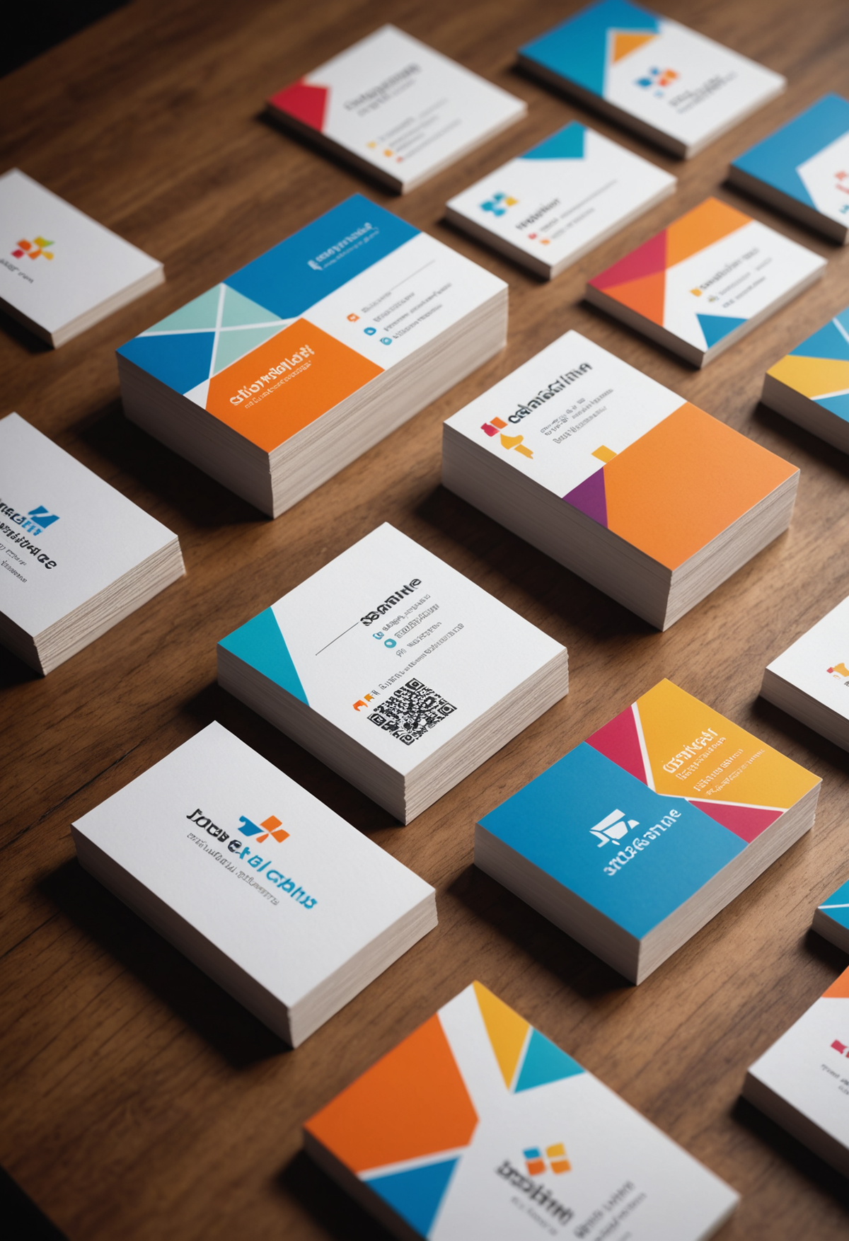
Business Cards & Stationery
Business Cards & Stationery gigs from Buxonline freelancers, starting at $1.
No gigs in this category yet.
About business cards & stationery
Business card and stationery design is the practice of turning an identity into physical objects that are handled, pocketed and filed. It covers cards, letterheads, envelopes, compliment slips, folders and the small printed pieces a company hands over in person, and it differs from screen work in one decisive way: the result is manufactured. Every decision eventually meets a press, a knife and a stack of paper.
That manufacturing reality shapes the craft. Artwork is prepared in CMYK rather than RGB, at 300 dpi or as vectors, with a bleed area extending past the trim line so a millimetre of drift at the guillotine doesn't leave a white sliver along an edge. Critical elements sit inside a safety margin for the same reason. Paper weight is a design choice as much as a material one: a 300 gsm card feels considered, a 250 gsm card feels thin in the hand, and the same ink looks different on coated stock than on uncoated.
Doing it well means anticipating what the finished object has to survive. Dark, heavily inked cards show every scuff and fingerprint unless they carry a matt laminate. Fine hairlines and small reversed type close up on absorbent uncoated stock. A foil block or spot UV needs its own artwork layer, prepared as solid shapes rather than gradients. The strongest work treats the constraints as material to design with, choosing a finish that suits how the card will be used rather than how it looks on screen at 400 per cent zoom.
Guides related to business cards & stationery
- Graphic design services from $1
- Logo design services from $1
- Become a Seller: start earning from $1
- Freelance jobs for beginners: start with no experience
- Freelance websites compared: what beginners should check
- Gig work for beginners: what it is and how to start
- Graphic design jobs you can do from home
- Micro jobs from $1 — start earning today
Business Cards & Stationery — questions and answers
- What paper weight and finish actually change how a card feels?
- Weight is measured in gsm, and the jump from 250 to 350 gsm is the difference between a card that flexes and one that stays rigid. Coated stock holds crisp detail and saturated colour; uncoated absorbs ink, softening fine lines but taking pen ink if anything needs writing on it. Matt lamination hides handling marks, gloss amplifies them, and soft-touch adds a velvety surface that fingerprints readily.
- Why does artwork need bleed and a safety margin if the card size is fixed?
- Cards are printed several to a sheet and cut through the stack, so the blade drifts by a fraction of a millimetre. Bleed extends any colour or image about 3 mm past the trim line, so drift cuts into artwork rather than past it and leaves no white edge. A matching inner safety margin keeps text and logos clear of the cut, since a design trimmed 1 mm off-centre otherwise looks obviously crooked.
- What sizes are standard, and does it matter which one you pick?
- Europe generally uses 85 by 55 mm, North America 3.5 by 2 inches, and Japan 91 by 55 mm. It matters practically rather than aesthetically: a card that doesn't fit a common wallet slot or cardholder gets bent or discarded. Square and folded formats stand out precisely because they break the convention, at the cost of fitting nowhere standard and usually needing custom cutting.
- How do foil, embossing and spot UV differ in what they demand from the design?
- Each needs a separate artwork layer defining exactly where the effect goes, drawn as solid vector shapes with no gradients or transparency. Foil sits on the surface and needs enough stroke thickness to hold, so hairlines drop out. Embossing deforms the sheet, which shows on the reverse and rules out artwork on both sides in the same spot. Spot UV is invisible until light hits it at an angle.
- Why do printed colours look duller than they did on the monitor?
- Screens emit light and cover a wider gamut than ink on paper can reproduce, so vivid RGB blues and greens have no CMYK equivalent and get mapped to the nearest printable value. Uncoated stock dulls further as ink soaks in. Working in CMYK from the start, checking a soft proof with the right paper profile, and specifying a Pantone for anything that must stay exact avoids the surprise.
- What belongs in a stationery set beyond the card itself?
- Typically a letterhead with margins that respect where a printer can actually put ink, a matching second sheet without the full masthead, envelopes in the sizes the correspondence needs, and an editable document template so internal documents don't drift. Consistency across those pieces is what makes the set read as one identity: shared margin logic, one type hierarchy, and the same restrained palette rather than each item reinventing it.


